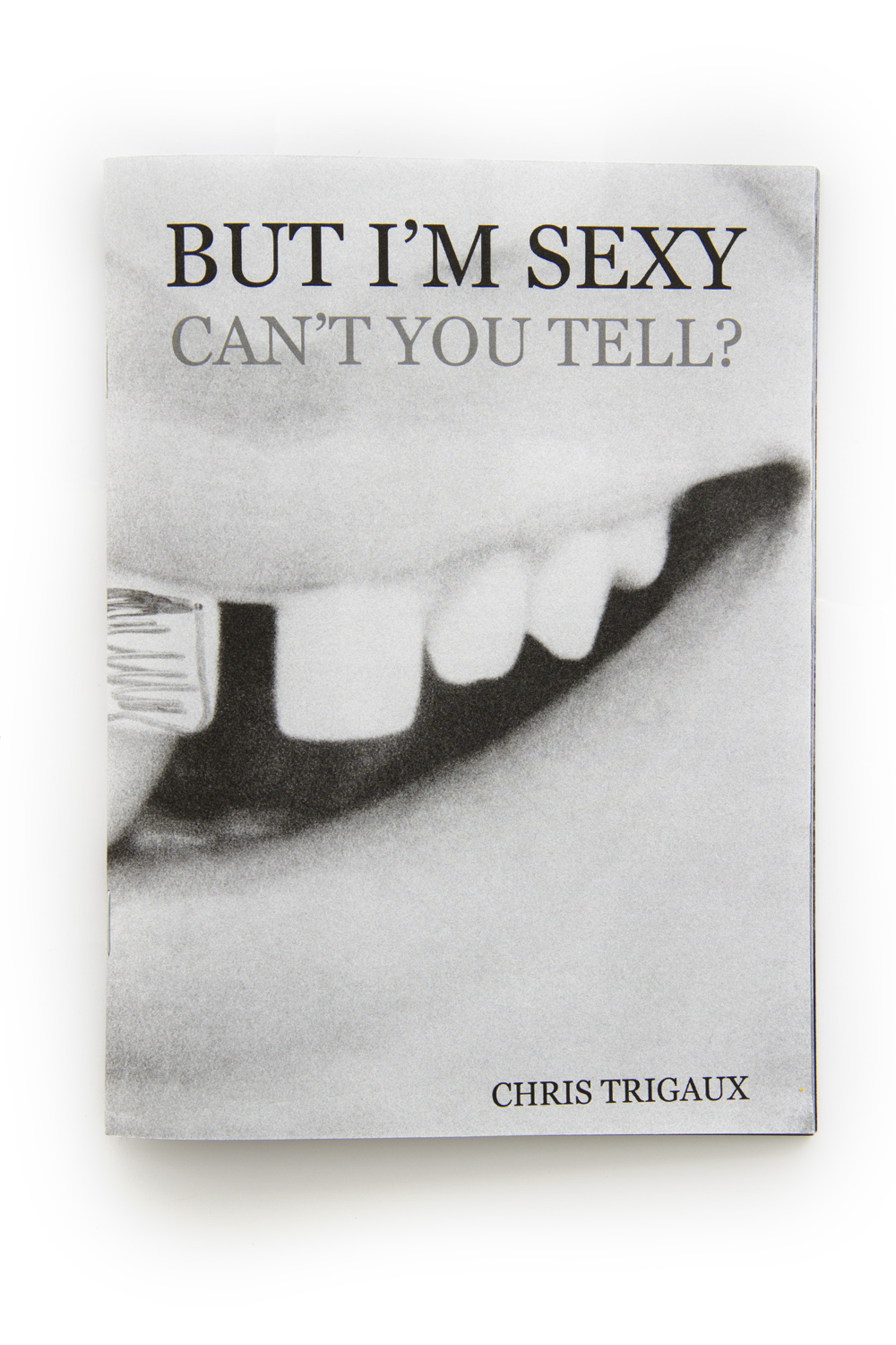
Chris Trigaux - But I'm Sexy, Can't You Tell?

My name is Chris Trigaux; I’m born and raised in Connecticut in the US. During high school, photography became one of my biggest interests. I would double up on photo classes and spend my free periods in the black and white darkroom at school. I also spent a ton of time googling stuff about cameras when I was home (still do). I’m a total tech nerd when it comes to gear. I just graduated with my Bachelor of Fine Arts in Art Photography from Syracuse University. I took a class there on photo books from master Doug DuBois, which really changed my whole outlook on images and art. That class, prompted me to want to start making self-published zines and books. I started Humble Parrot in 2013 as a publishing moniker, an alter-ego to produce work under. I liked the idea of the parrot, as this phenomenon that repeats whatever is said around it, reproducing it’s environment similar to a camera. And it’s a humble parrot because it’s unassuming candid street photography I’m interested in, not grandiose fashion photography or Gregory Crewdson style work. The publishing moniker helps build a brand for future projects, and gives credibility to the work. I got a high school buddy (shout out to Joe Maccarone) to make the logo, setup a Big Cartel website, and I had a “publishing company.” The internet is this amazing device for emerging artists, that allows us to circumnavigate traditional publishing routes. I plan on continuing to pump out content and zines through Humble Parrot. I’m also open to collaborations and bringing other artists onto the brand. It’s still in the infant stage, there are so many possibilities!
The zine that launched the brand is But I’m Sexy, Can’t You Tell?, which I put out in late 2013 (it still available). It was a long process, mostly because I’m new to photography and book arts. I went through crappy edit after crappy edit until I finally settled on something I felt was publishable. I would show the mock-ups to my professors and trusted friends for feedback and see what worked and didn’t. But once you get to a certain point, you just have to make a decision. Eventually people start to give contradictory advice because they feel obligated to say something and the edit is either too dense or too sparse, or flows too quickly or slowly, or it’s too long or too short.
The edit is framed around two things. The first being themes of sexuality and representation, and how those interact in the urban space. To de-academicize that, it’s interesting to me and telling in our culture when someone graffitis a penis onto an ad, or how blatantly phallic a sausage advertisement can be.
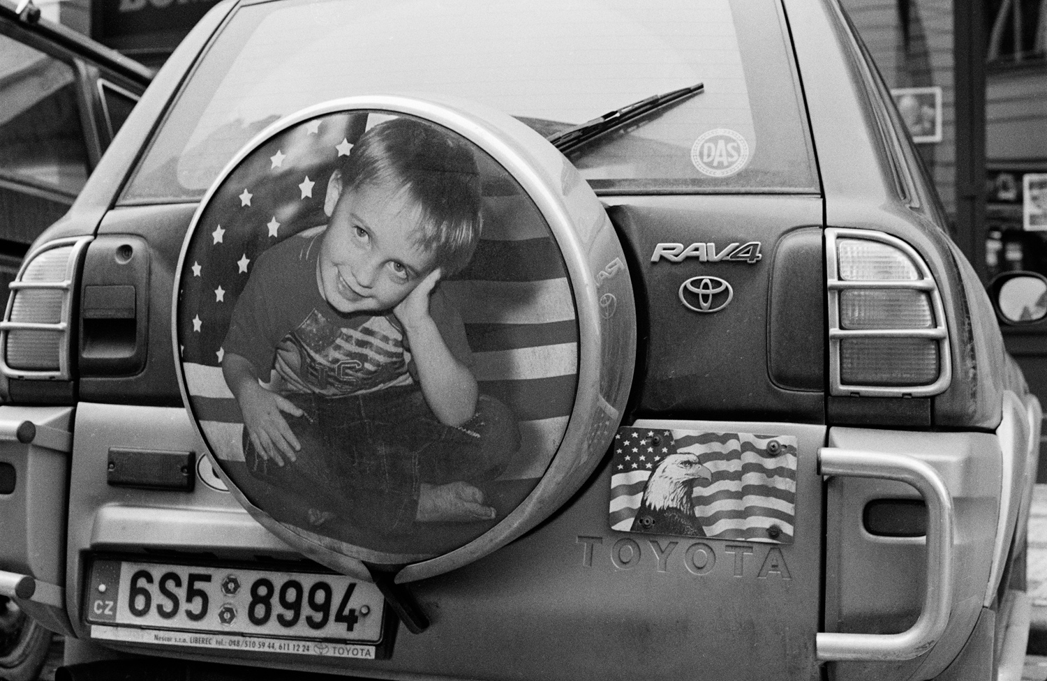
One of my favorite images in the zine is just over half way in the edit, of a back of a car. On the spare tire is a printed image of a child in an American flag t-shirt with an American flag backdrop. Also on the car is a plate with an American flag and a bald eagle. All of this is on a Japanese car with a Czech Republic license plate. For me, this interaction is really interesting, how this individual chooses to represent himself with this absurd Americana iconography. It’s also just plain funny for me as an American to look at that picture. Humor plays a big role in my edits.
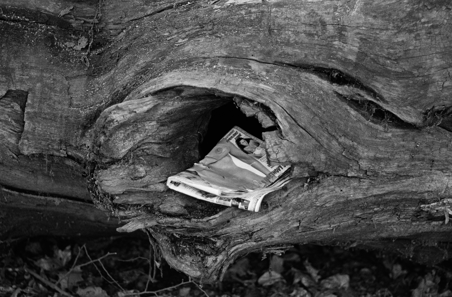
The second major sequencing criteria is formal, meaning matching similar shapes and lines from one picture to the next. The middle image of the edit, of the porn magazine in the circle of a tree in surrounded before and after by pictures featuring big circles. Statue of liberty crown, big table, spare tire - I use stuff like that to keep things relatable and build a rhythm.
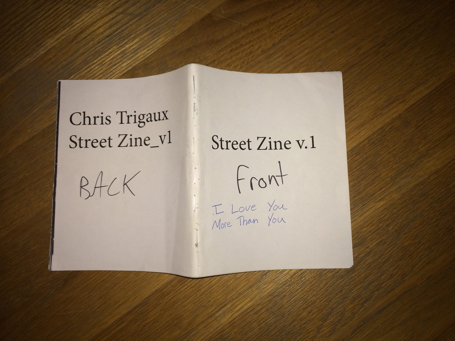
The title was a struggle to settle on too. The other major contenders were “I Love You, More Than You” and “Unexceptionally Stable.” The former being too broad and more generally about street photography (for me), and the latter being too clunky. I wanted something that rolled off the tongue and had a stickiness in the mind while still describing the work. I got to the point where I felt satisfied with everything enough and went to print. I did a run of 77 copies through an awesome production house called Conveyor Arts.
I think if I were to do it all over again I would try and make the edit more purposeful. By that, I mean easier to understand and sharply to the point. I was editing in the mindset of these beautiful large format art books I was looking at in class that dealt with subtle and abstract themes. They are often sequenced in a way that requires a slow thoughtful reader to come back to the book multiple times. The medium of a zine is quick and small. People don’t slowly page through a 5 inch stable-bound product the same way they do a 200 page rag paper book.
That’s the basics of Humble Parrot and me. To keep up with me and my ventures you can check out my tumblr and join the Humble Parrot mailing list. Oh yea, and buy the zine.